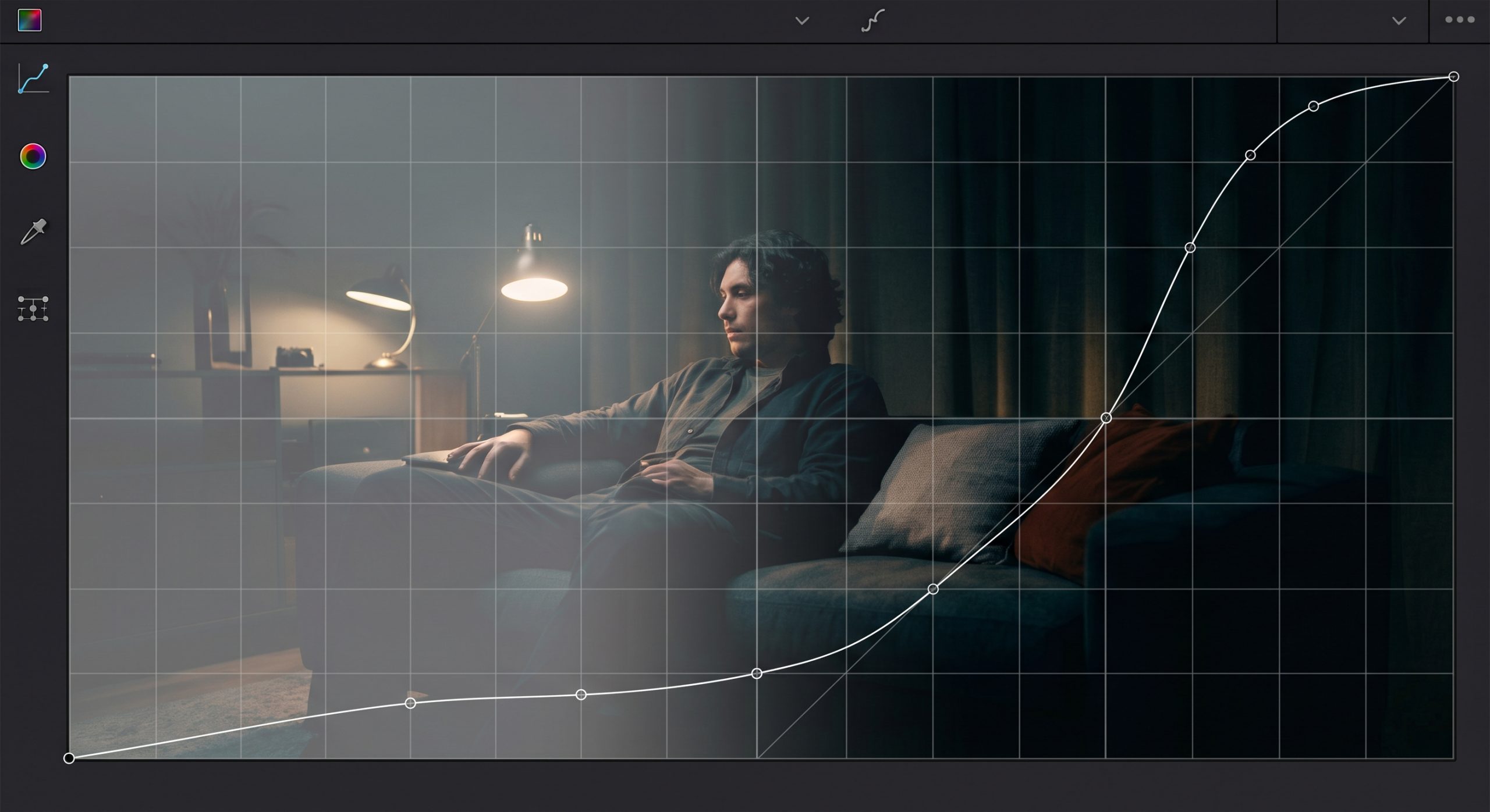

Blacks washed out or crushed is one of the most common notes colorists get from clients, and it usually comes down to two hidden problems: gamma mismatch and data levels.
Clean, deep blacks anchor a grade in color grading and black levels work. Everything else, midtones, skin, highlights- sits on top of that foundation. If your blacks are washed out, inconsistent, or crushed, it doesn’t matter how good the rest of your grade looks. The whole thing falls apart.
It happened to me way too many times: nail the grade on my monitor, feel great about it, send it off, and get a note back saying the video looks dark, crushed, or washed out. So I dug into every factor that affects how your blacks actually show up on someone else’s screen. Two things cause almost all of it: a mismatch in gamma, and a mismatch in data levels.
1. Gamma Mismatch
What is gamma, actually?
Gamma is the curve that maps your image’s signal values to actual brightness on a screen. It isn’t linear, it’s a power curve, and that curve decides how bright your midtones and shadows look relative to your blacks and whites. Different devices and delivery standards are calibrated to different gamma curves, and that mismatch is the whole problem: if the gamma your image was graded for doesn’t match the gamma of the screen it’s being viewed on, your blacks will look wrong even if nothing else changed.
Standard gamma values by delivery target
- 2.2, Web / sRGB. Computer monitors, phones, most web playback. Chosen to match typical viewing conditions: a bright-ish room with ambient light bouncing around the screen. Because the room isn’t fully dark, a lower gamma keeps shadow detail visible instead of crushing it into the surrounding light.
- 2.4, Broadcast TV. TV viewing rooms are dimmer than an office but still not pitch black. 2.4 adds more contrast than 2.2 to compensate, which is why Rec.709 broadcast masters are built around this value.
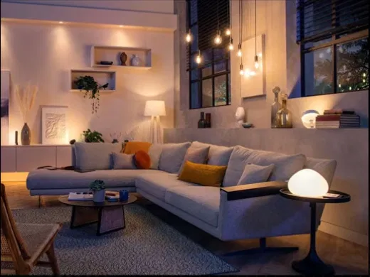
A dim, ambient-lit living room, the typical viewing environment Rec.709’s 2.4 gamma is calibrated for.
- 2.6, DCI Cinema. Theaters are about as dark as a viewing environment gets, and projectors physically can’t produce truly deep blacks the way a calibrated monitor can. 2.6 pushes extra contrast into the image so it still reads as punchy despite the projector’s limited native contrast and ambient light bouncing off the screen and room.
The Mac gamma story
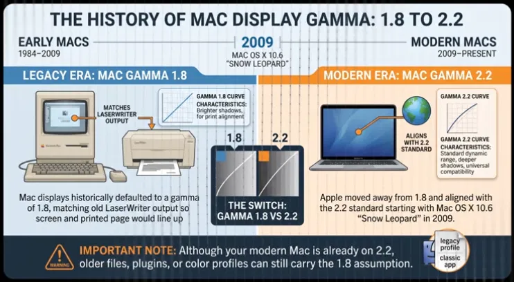
Mac displays historically defaulted to a gamma of 1.8, a leftover from the print/publishing world, matching old LaserWriter output. Apple moved off that and aligned with the 2.2 standard starting with Mac OS X 10.6 “Snow Leopard” in 2009. So on Snow Leopard or newer, a Mac is already on 2.2, same as the rest of the world, but older files, plugins, and color profiles can still carry the 1.8 assumption.
Rec.709, pick your flavor
Rec.709 isn’t one single thing, there are several flavors of it floating around your NLE and color grading software, and mixing them up is one of the most common reasons a grade comes back looking wrong.
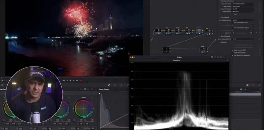
- Rec.709 (straight / 2.4): The “textbook” version, the base color space paired with the standard 2.4 broadcast gamma. Safest and most universally compatible for broadcast and professional delivery. See the official ITU-R BT.709-6 recommendation for the full spec.
- Rec.709 Scene: How QuickTime and Apple’s frameworks historically interpreted Rec.709 media, using a gamma closer to 1.96 instead of 2.4. Footage tagged this way looks brighter and flatter in QuickTime versus a broadcast monitor.
- Rec.709-A: DaVinci Resolve’s fix for the Rec.709 Scene mismatch, applies a gamma of roughly 1.96 so the Resolve viewer matches QuickTime Player and macOS. Not a new color space, just a compensation layer for keeping your grading monitor and Mac’s playback in sync, not for broadcast delivery.
- Rec.709 + gamma 2.2 / 2.4 / 2.6: Some software lets you pair the Rec.709 gamut with a gamma value of your choosing. Useful when you know exactly where the final output is going, but the software won’t necessarily warn you if you pick wrong.
2. Data Levels
Auto, Video, or Full, know the difference
- Auto: lets the software guess. Don’t rely on this blindly.
- Video (Legal/Limited) levels: the standard for TV and most broadcast delivery. Black sits at code 16, white at code 235 (8-bit terms).
- Full levels: the standard for computer monitors and most web playback. Black is 0, white is 255.
Why this wrecks your blacks: If footage tagged as Video levels gets interpreted as Full levels, your black point of 16 reads as dark gray, the image looks washed out and flat. If Full levels footage gets interpreted as Video levels, everything below 16 crushes into pure black and you lose shadow detail. This single mismatch is probably responsible for more “your video looks washed out / crushed” client notes than anything else. The Post Process breaks this down in more detail if you want to go deeper.
Broadcast safety standards
Most broadcasters want black pinned at 0% and reference white at 100%. Delivery specs typically build in a small tolerance window: RGB components allowed between roughly -5% and 105%, luminance held to -1% to 103%. Older NTSC-era standards used 7.5 IRE “setup” black; modern ATSC has moved to 0 IRE.
Note: Broadcast tolerance numbers vary by network and platform, always confirm against your actual delivery spec before quoting exact figures.
3. Protecting Your Blacks
- Calibrate your monitor. Non-negotiable for color-critical work.
- Export with different settings. Test across Video and Full levels, and different gamma tags.
- Use a quick export to test the output. Render a real file and watch it the way your audience will.
- Export stills. Check frame grabs outside your NLE in a plain image viewer.
- Check your work on at least three different screens. Phone, TV, tablet.
Want more practical color grading workflows like this? Check out my REC.709 vs LOG vs RAW breakdown for a deeper look at color spaces, or explore my DaVinci Resolve training programs to build these skills hands-on.
Further Reading
Gamma & Rec.709
- ITU-R BT.709-6, Official Recommendation
- Rec. 709, Wikipedia overview
- ITU-R BT.1886, Reference EOTF for SDR displays
- Rec.709 vs Rec.709-A explained
- QuickTime gamma-shift bug explained