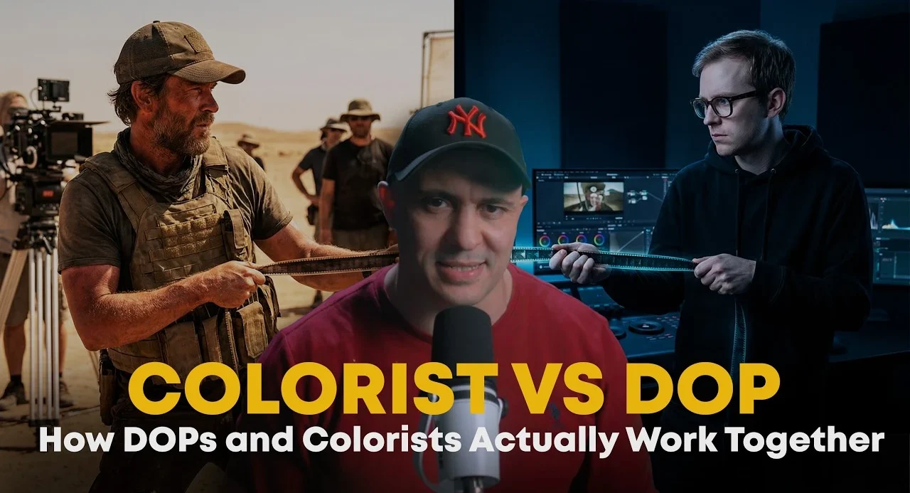

The rivalry between the Director of Photography (DP) and the Colorist is an antiquated hurdle. The most successful images aren’t “fixed” in post-production; they are elevated through a continuous relay race that starts during pre-production.
1. Pre-Production: The Foundation of Contrast and Color
Before a camera rolls, decisions regarding wardrobe, set design, and lighting ratios dictate the ceiling of your final image.
- Color Theory in Practice: Don’t just rely on trends. Utilize complementary color theory (such as teal and orange) to create natural separation between your talent and the background.
- Contrast Ratios: Define your mood early.
- Beauty/High-Key: Aim for 1:1 or 1:2 ratios.
- Dramatic/Low-Key: Target 4:1 or 8:1 ratios.
- Technical Tip: Avoid tight patterns or striped clothing to prevent moiré—a persistent, difficult-to-resolve digital artifact.
2. On-Set: Capturing a “Healthy Negative”
A DP’s primary responsibility is to provide the colorist with a clean, high-quality signal.
- Exposure Discipline: Understand your camera’s specific log curve. If your sensor is prone to noise in the shadows, overexposing by a stop is often safer than underexposing on set to achieve a “moody” look.
- The Four Pillars of Separation:
- Color: Use Kelvin temperature shifts (e.g., warmer key lights vs. cooler backlights) to create depth.
- Exposure: Keep the talent at least one stop brighter than the background.
- Texture: Use gobos or practical lights to break up flat backgrounds.
- Depth of Field: Leverage fast lenses to blur distractions.
3. Post-Production: The Handshake
If the groundwork is laid, grading becomes an exercise in refinement rather than rescue.
- Real Lighting: Use power windows and masks to guide the viewer’s eye, effectively “painting” light into the scene that wasn’t captured in camera.
- Skin Tone Refinement: This is the critical stage for high-end commercials, where hues are balanced, and textures are softened to elevate the final product.
- The Golden Rule: The best grade is invisible. If the audience recognizes the image has been processed, the workflow has failed.
Trainer’s Note: “I often see students obsessing over ‘looks’ before they master their signal. If your exposure isn’t clean, a 3D LUT won’t save you. Learn to read your Waveform before you touch your color wheels.”
Recommended Free Resources for Workflow Mastery
Color Grading Tools & References
- **DaVinci Resolve (Free Version):** The industry standard for professional grading.
- **Adobe Color:** A free, powerful tool to experiment with color harmonies and complementary theories.
- **Mixing Light (Free Library):** A collection of high-quality articles and videos on color theory and technical grading.
Cinematography & Lighting Guides
- **CineStudy:** A non-profit resource for learning filmmaking fundamentals, including lighting ratios.
- **FilmLearn:** Offers free tutorials on the basics of exposure and lighting.
- **YouTube – Frame Voyager:** Visual explanations of cinematic lighting setups and scene breakdowns.
Technical Standards & Education
- **Blackmagic Design – Training:** Access to certified curriculum, PDFs, and training project files.
- **Manufacturer Support Pages:** Always consult your camera manufacturer’s official white papers for your specific Log curve and dynamic range data.
- **ShotDeck:** Use this to build shared mood boards between the DP and the Colorist during pre-production.